Spent time today perusing some of the wedding stationery I’ve designed over the past few years, appreciating how it provides great opportunity for creativity and exploration of more unusual production techniques, but mainly for the joy of designing something totally unique for great old pals.
Here’s a selection of my faves…
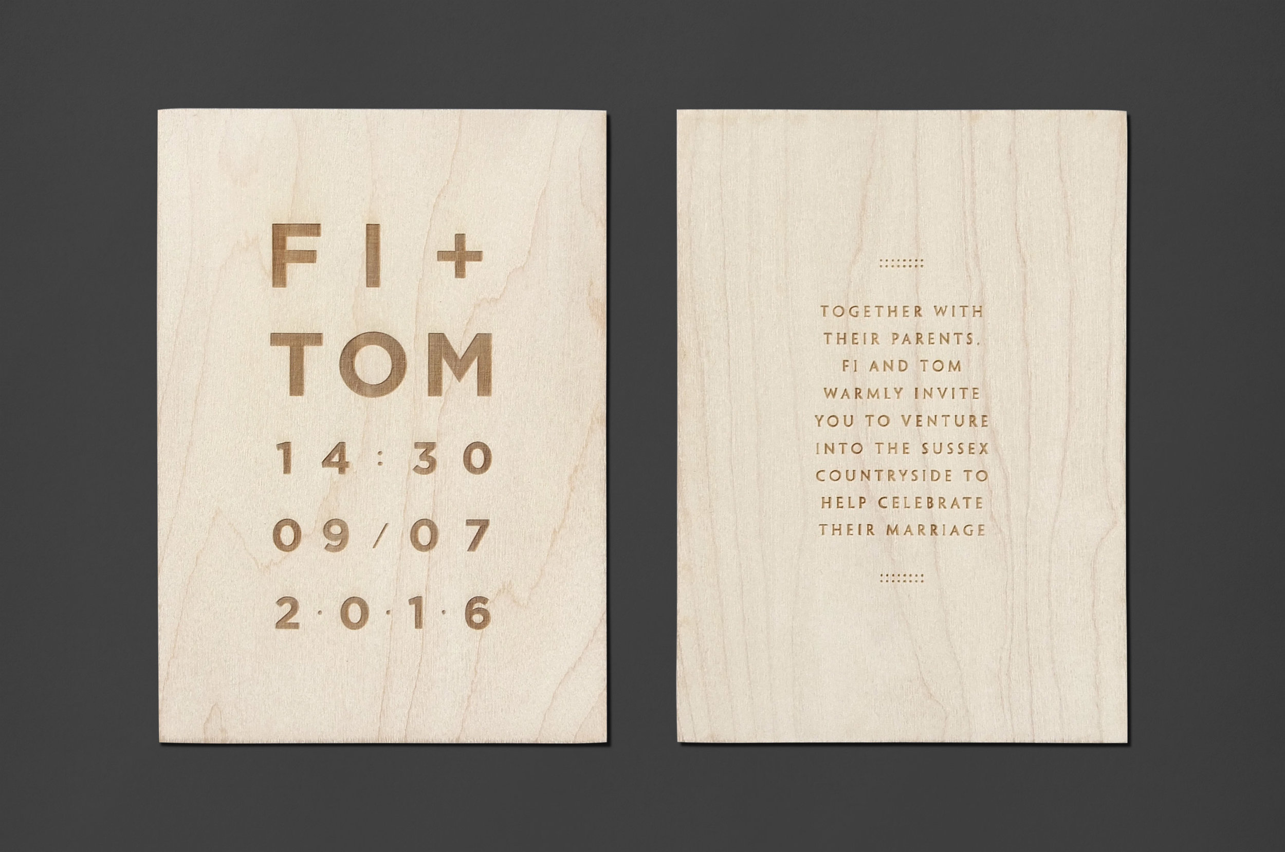
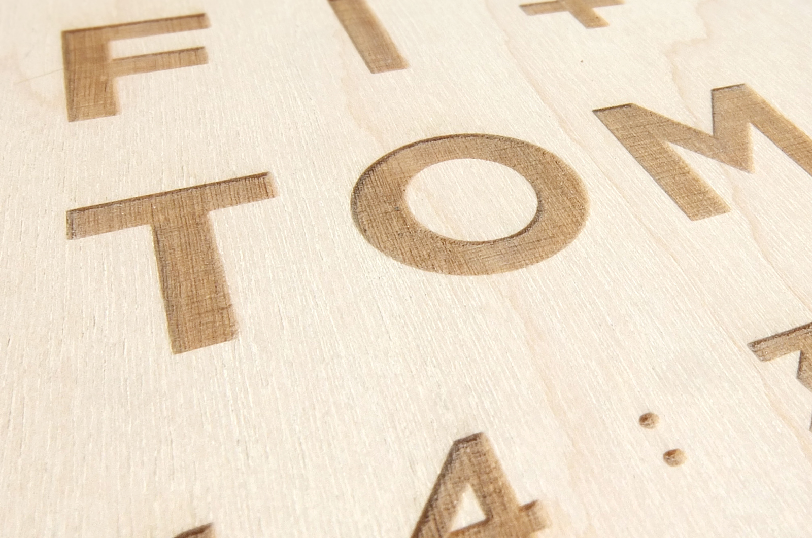
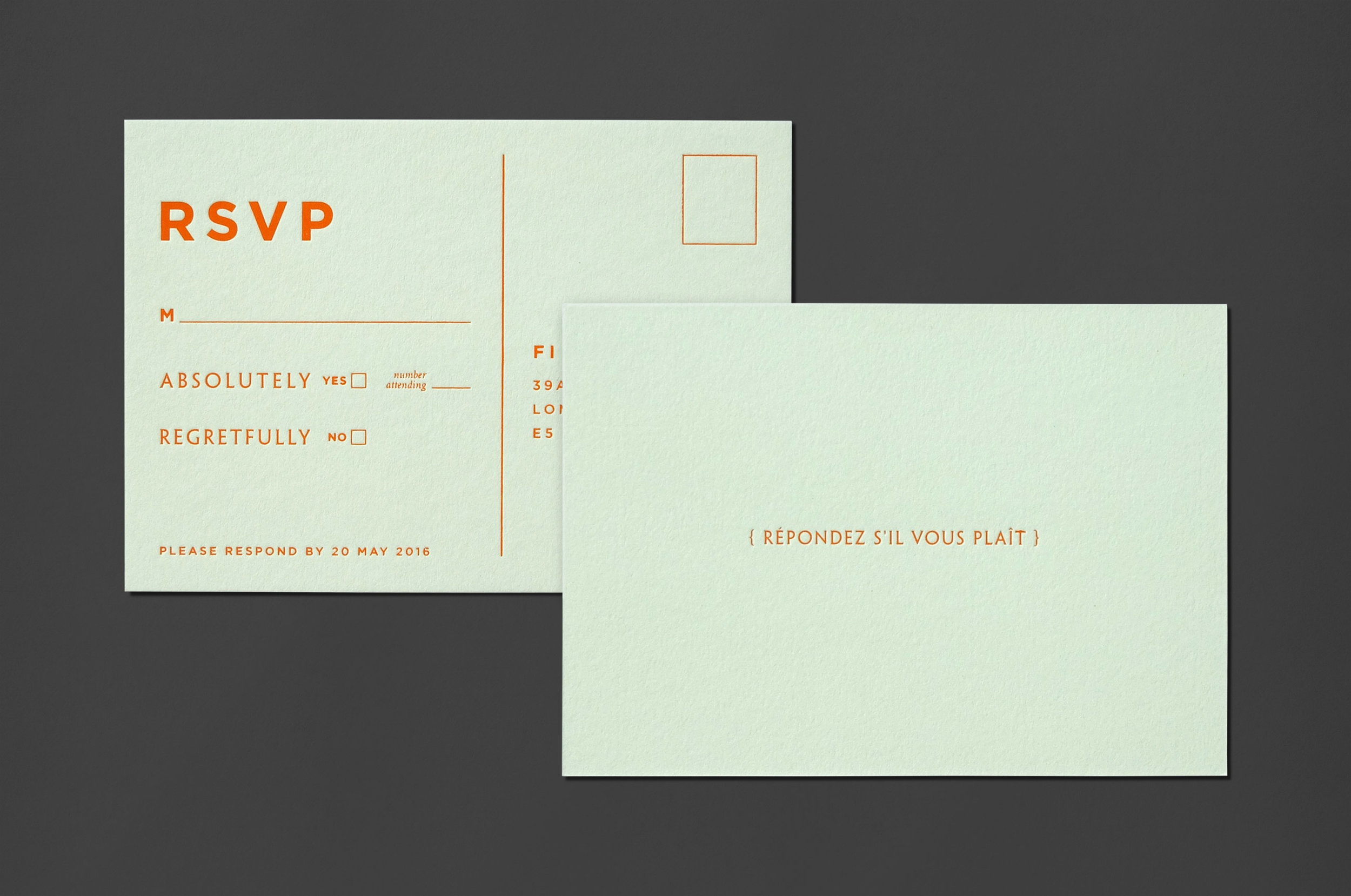
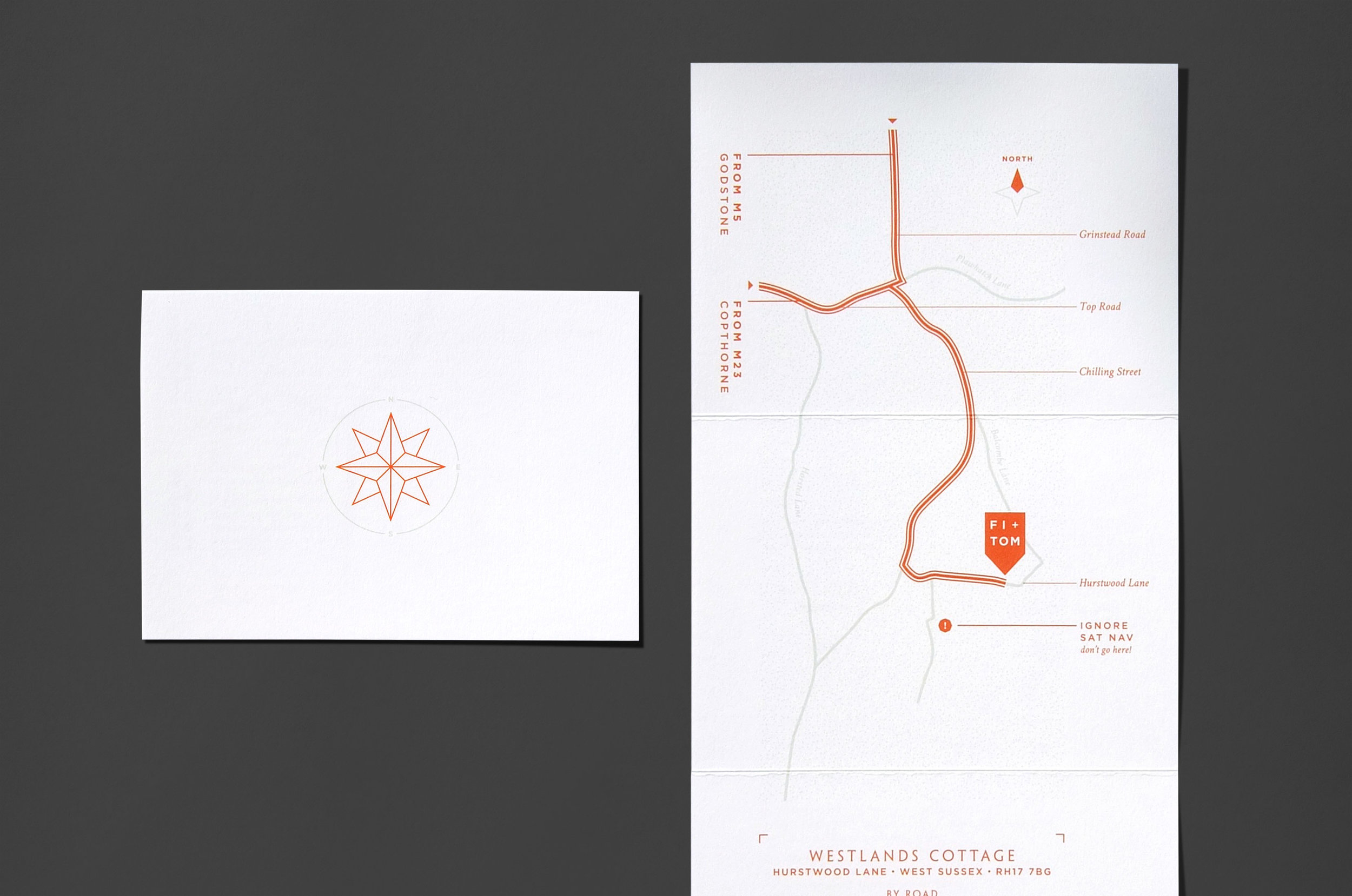
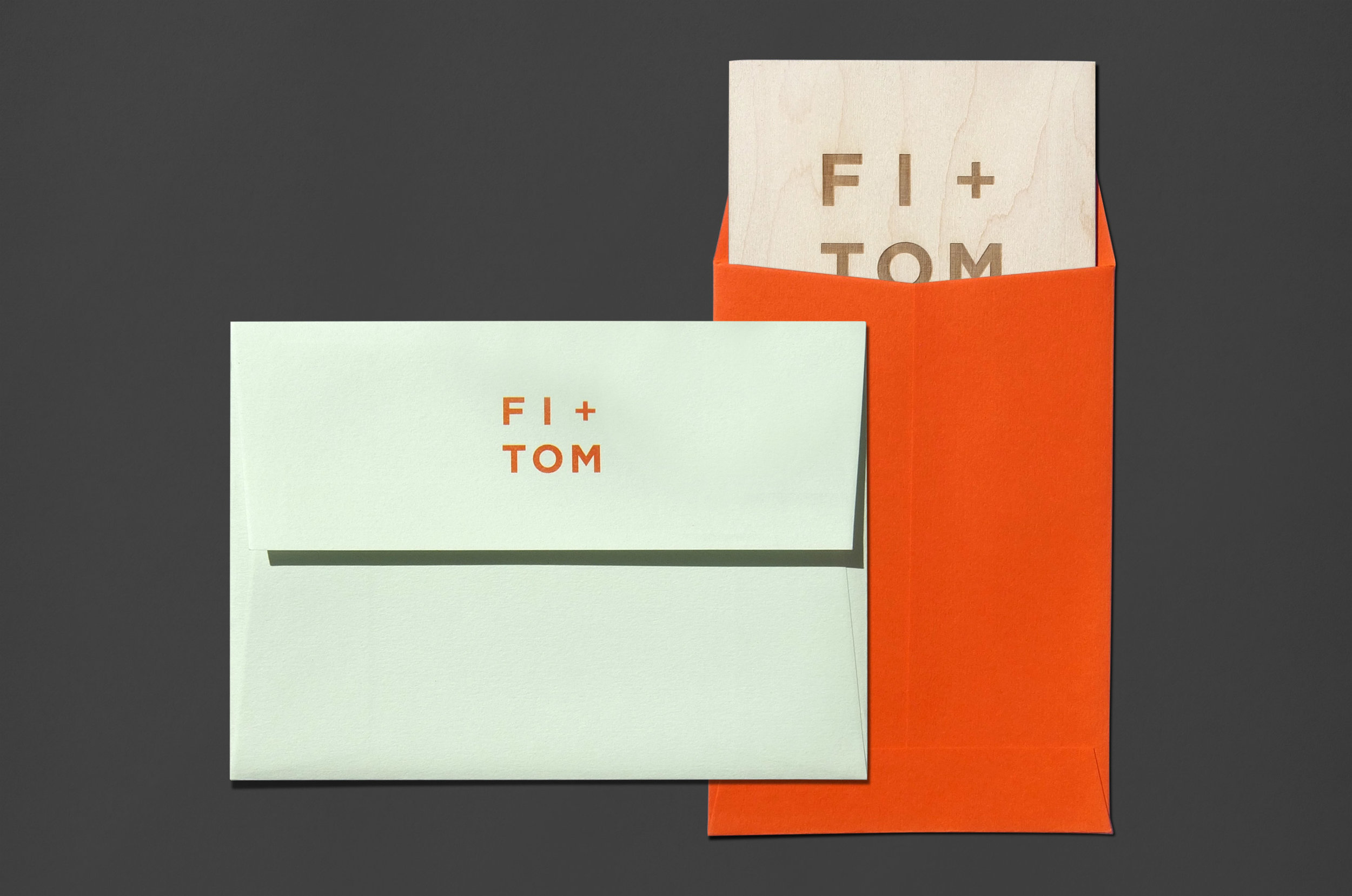
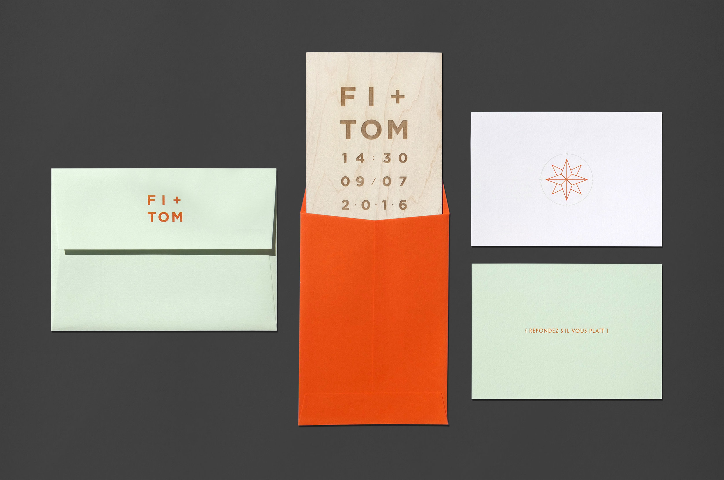
Fi and Tom own a bespoke kitchen design company, specialising in plywood construction, so it felt only appropriate to include this aspect in the design. We etched the type into white wax coated 3mm ply, each invitation unique in pattern. Colorplan Pistachio and Mandarin compliment, with a particularly satisfying matt orange foil emboss on the RSVP card – YUM.
BTW if you are thinking about redesigning your kitchen do check out Witlof.
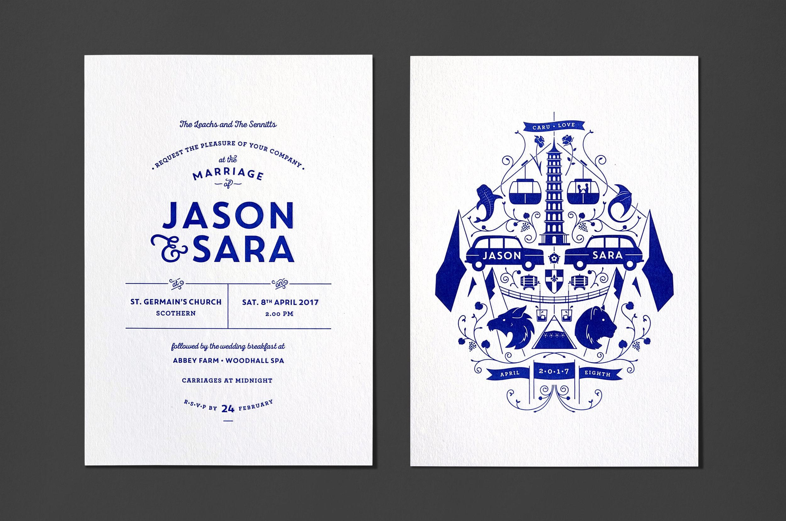
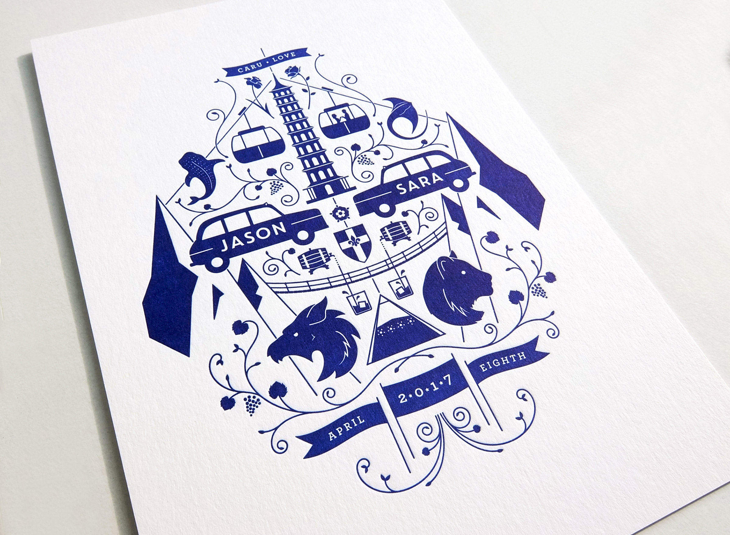
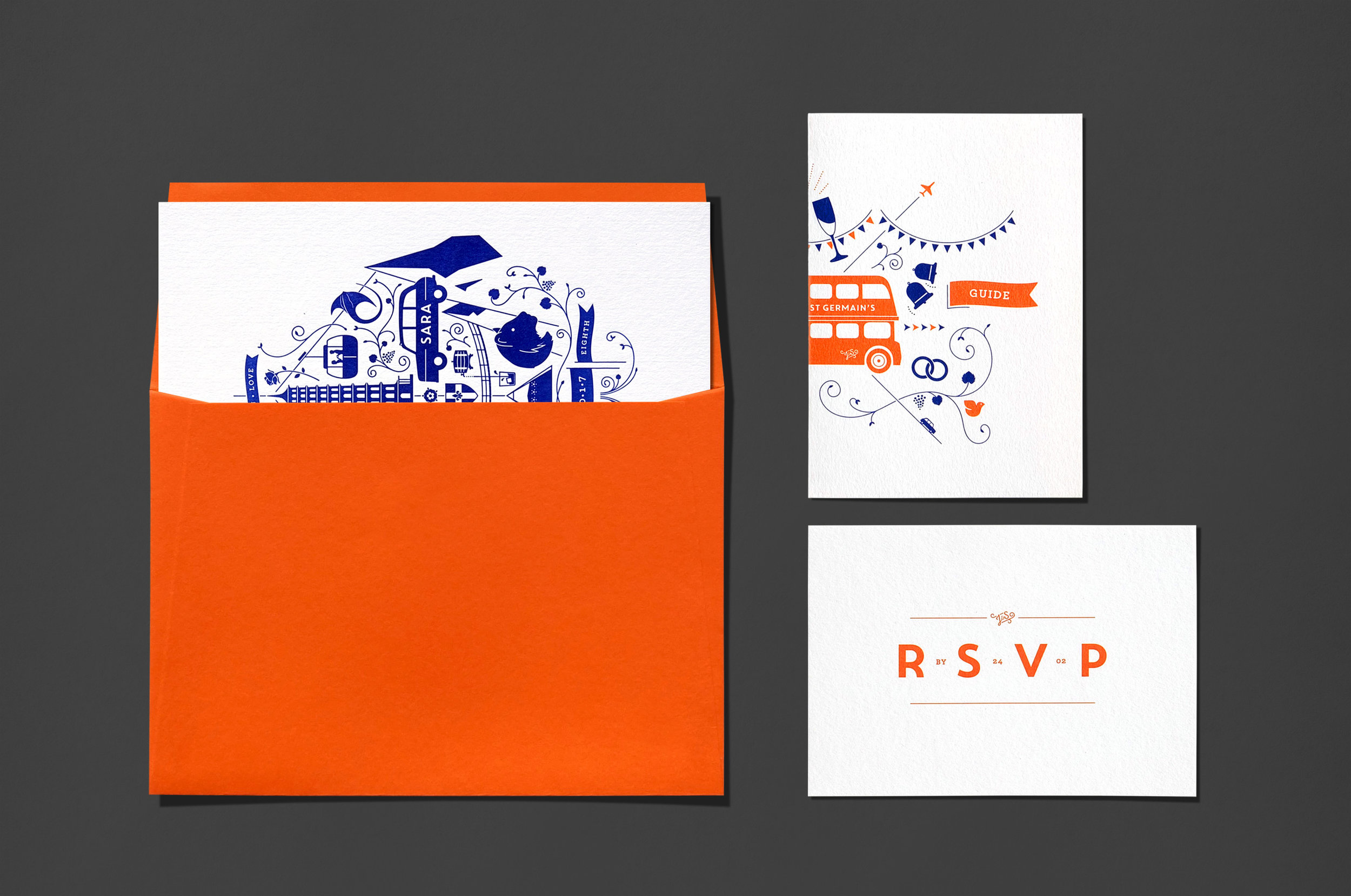
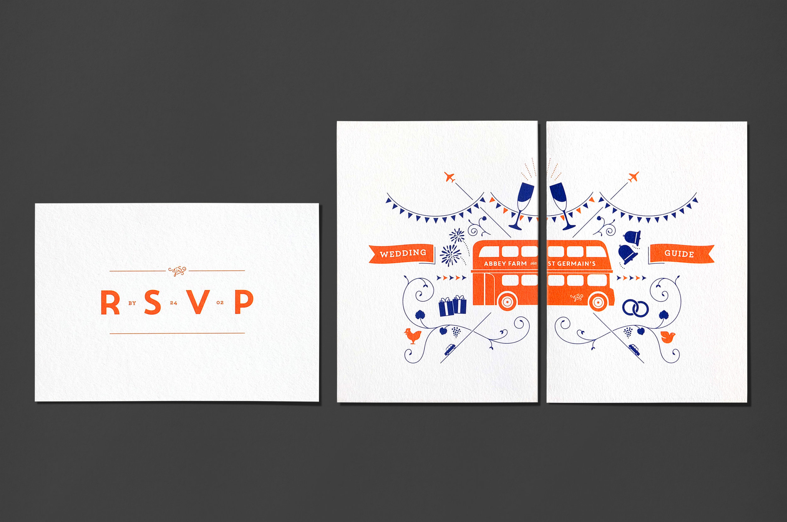
Sara and Jason expressed a desire for a kurbit-inspired design – a symmetrical merging of elements significant to them as individuals and as a couple. The invitations saw the deep, inky Pantone Reflex Blue letterpress printed onto a tactile, spongey 638gsm cotton board. To echo the colours on the day, Colorplan Mandarin envelopes were chosen, hints of which were brought in throughout the stationery set.
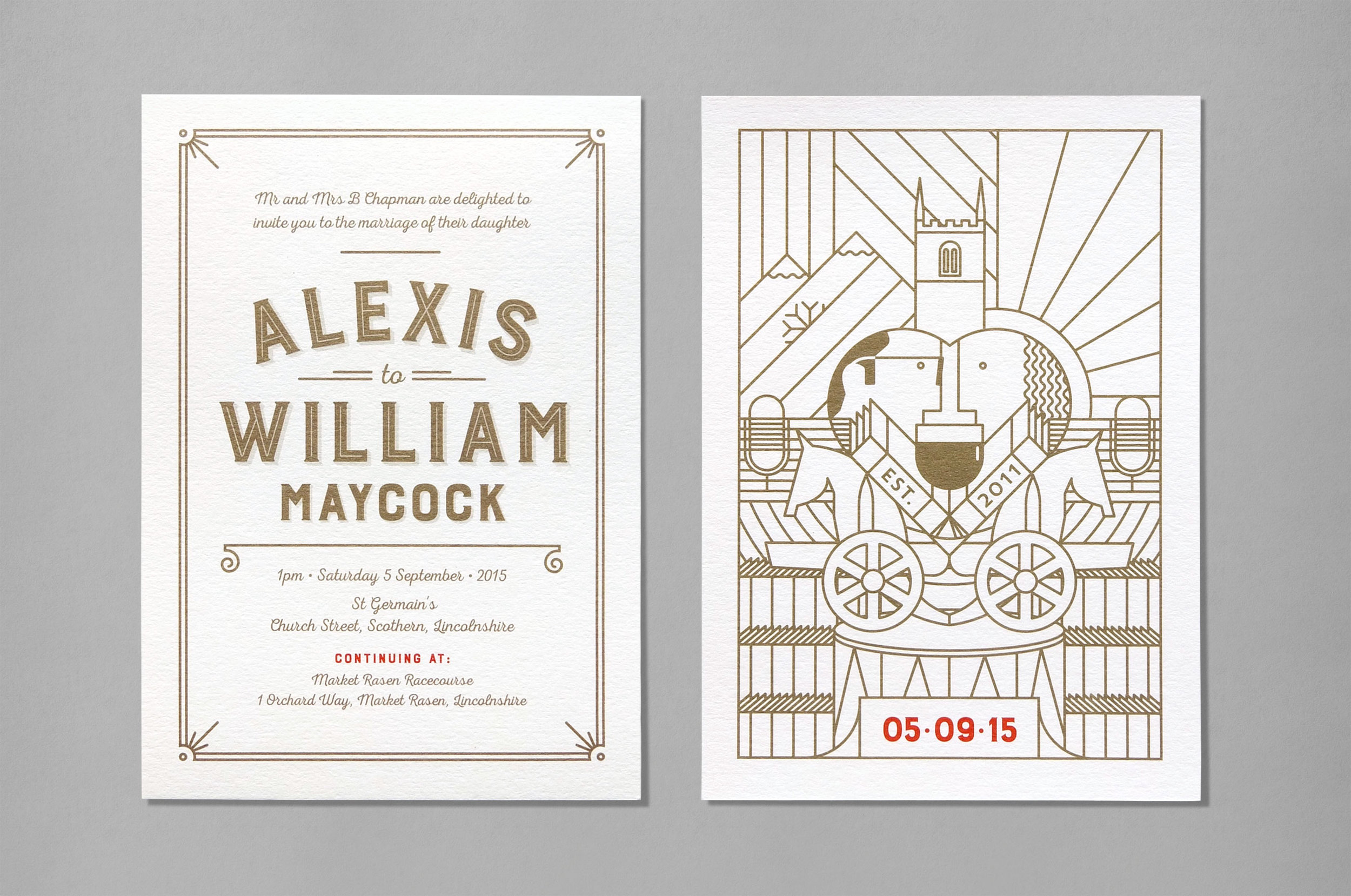
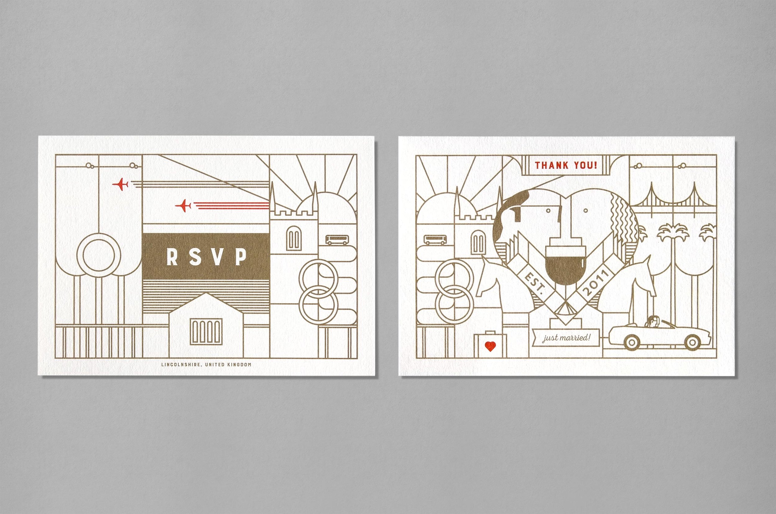
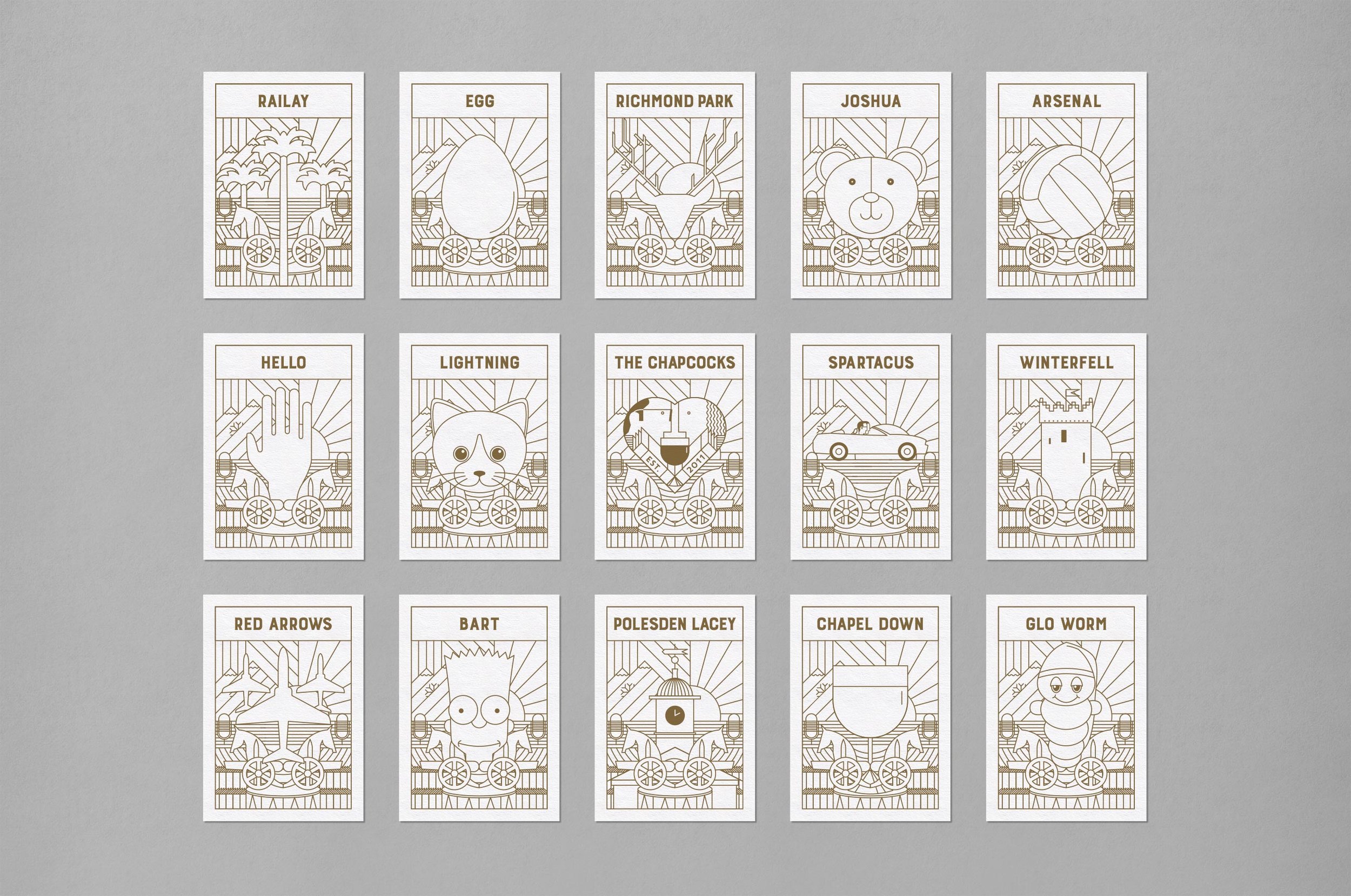
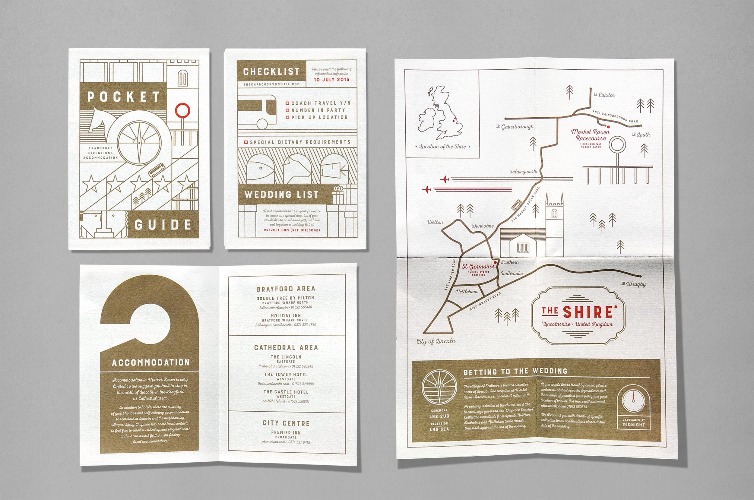
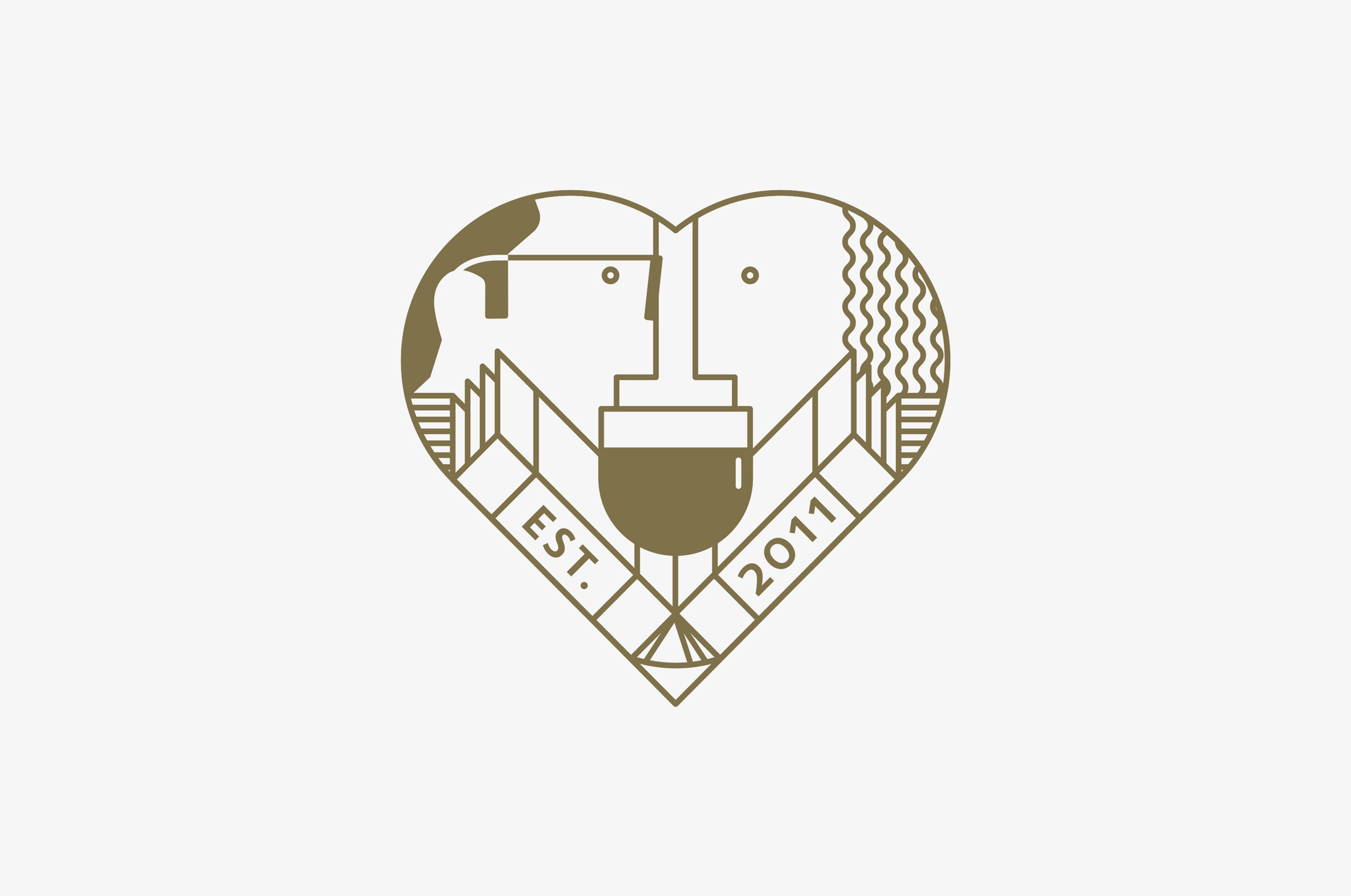
When The Chapcocks, aka Alexis and William, got hitched back in 2015 they asked for a design the encompassed their hobbies and interests, they also spoke about the possibility of a ‘wedding logo’. We took that theme and went for it – invitations, RSVPs, table names, menus, bus names (!), race cards, thank you cards, personalised engravings onto specially commissioned sculptures (that’s right). This wedding was branded. As for the production, we used Colorplan Bright White throughout with a Pantone metallic gold ink. Nice.